UX Case Study
Binder App
To learn about the UX process, I completed a full UX Design cycle: User Testing and Synthesis to define the problem to be solved by a new app, and Design Sketches and Interactive Wireframes to refine the app into a developable asset.
In this case, the idea was to create a Reminder/To-Do List app that was different from the many existing notes apps, and solved some problems users had with them. I started by reviewing comps: Google’s Tasks (which I have used in the past,) Apple’s Notes & Stickies, Microsoft’s To-Do, and Evernote. I also looked at variety of calendar apps specifically to see how their note functions worked and what sorts of options were presented for types of reminders.
A digital wireframe of the Binder app.
I used what I found (and what I didn’t) to develop a set of User Testing interview questions that explored how people currently kept track of their daily tasks, what apps they’ve tried, what they liked and didn’t like about those processes, and some “Blue Sky” questions that got users to think about what they’d like to see from the Reminder App of the future.
The user interviews challenged a lot of my assumptions about the notes app space, but the raw, qualitative data required some serious Synthesis to become usable for the design phase. Over the course of a week, I teased patterns out of the interviews by separating out various needs and desires and grouping them in different ways, finding areas where user needs aligned, and where they diverged.
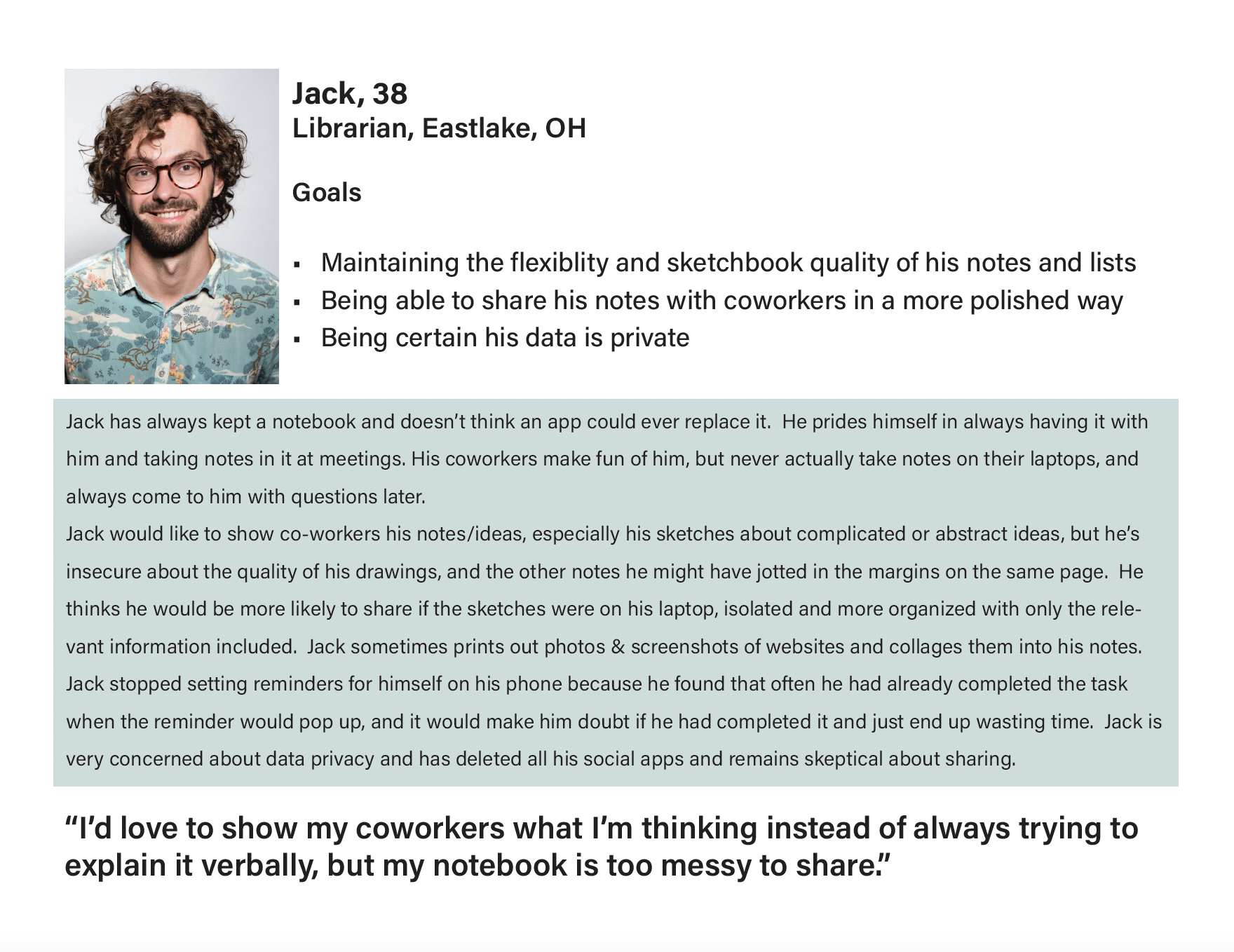
This data became a set of Design Tenets, or criteria my app absolutely must have to meet users needs, and User Personas, profiles for two imaginary people with clear needs that correspond to multiple users that I interviewed. This way, any time I thought about adding a feature, I could think about how it would impact both “Rachel” type users, and “Jack” type users, to see how helpful it would be in the various ways users might use the app.
Rachel - Integrated
Rachel’s needs largely correspond with users who work in very digitally integrated environments. They need any app they’re using for work to play nice with all the others.
Jack - Analog
Jack represents users who are using paper notes in more complex ways, and would like to have complex multimedia digital notes that could help their share their ideas with colleagues professionally.
Guided by the tenets and personas, I was able to begin fleshing out an app that would meet users needs and have a cohesive identity and reason for being. I named the app Binder, because it seemed like that’s what all potential users were looking for: an app that they could bring the world into, that would keep them organized, and that could enable the sharing of multimedia “collaged” notes, a digital fusion of a paper planner and a sketchbook.
I wanted to keep the interface as clean as possible to allow for opportunities for personalization. The notes needed to be the focus.
These initial sketches were then put through a design review with more potential users to see if the layout, icons, features, and structure of my ideas made sense to the target demographics.
I used that feedback to create a series of low fidelity digital wireframes that further demonstrated the layout and functionality of the Binder app. These digital wireframes then underwent a series of reviews by other designers, and further rounds of refinement.
Four key User Journeys through the Binder App were wireframed in Figma and the flows mapped with Marvel.
Go ahead and click through them below!


